For a recent project, we were tasked with creating a sophisticated, masculine office for the busy CEO of a home textile company. Surrounded by bold patterns and rich color in his business, he wanted us to help him create a softer, more serene look and feel in his office space - without sacrificing style. The client also asked for a more eclectic look; well curated but not too matchy-matchy… and without the modular feeling of the standard office system.
We started the re-design by thinking of all the functions that the office needed. Not only is this the home base for the CEO when he’s not traveling, it’s also where he hosts clients (read: big wigs), cut-throat negotiations (okay, they’re rarely “cut throat”) and small team meetings - so the space needed to work on both a personal and public level.
To address these needs, we created 2 work zones. The CEO’s personal space - where he needs to comfortably review and store paperwork, work at his computer, take calls - and other titan-of-industry-type activities. And his meeting space - where clients or team members will join him for discussions and strategy sessions.
From there, we began playing with the concept of swapping in rich textures to create contrast - instead of color. We found smooth leathers and glossy woods and layered them with shiny platinum and etched zinc to create generous dimensions and tonal symphonies that crescendo throughout the room.
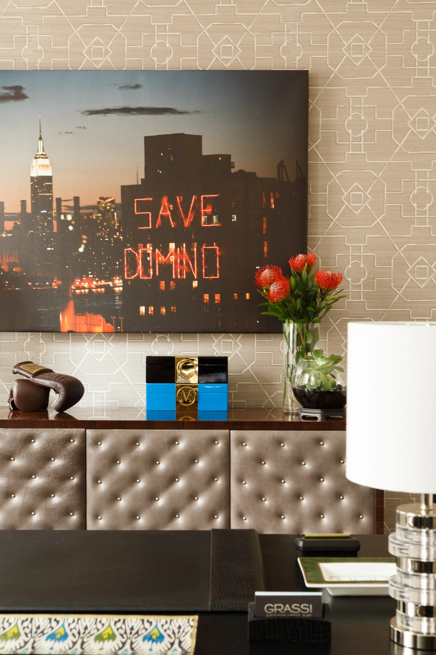
We anchored the personal space with a textured, neutral-toned wallpaper. The subtle, printed woven grasscloth wall covering from Thibaut creates a serene accent wall that sets the back drop for space. Next we had a beautiful custom computer desk built by La Bastille which features neutral, onyx colored-legs and is topped with a matte zinc that was etched with a classic, Art Deco-inspired geometric pattern. To soften things up, we layered in a black leather wrapped Campaign Trestle writing table from ABC Carpet & Home. With it’s rich, glossy rosewood veneered drawers adorned with shiny stainless steel campaign fittings and it’s brilliant stainless steel bases, this desk is a
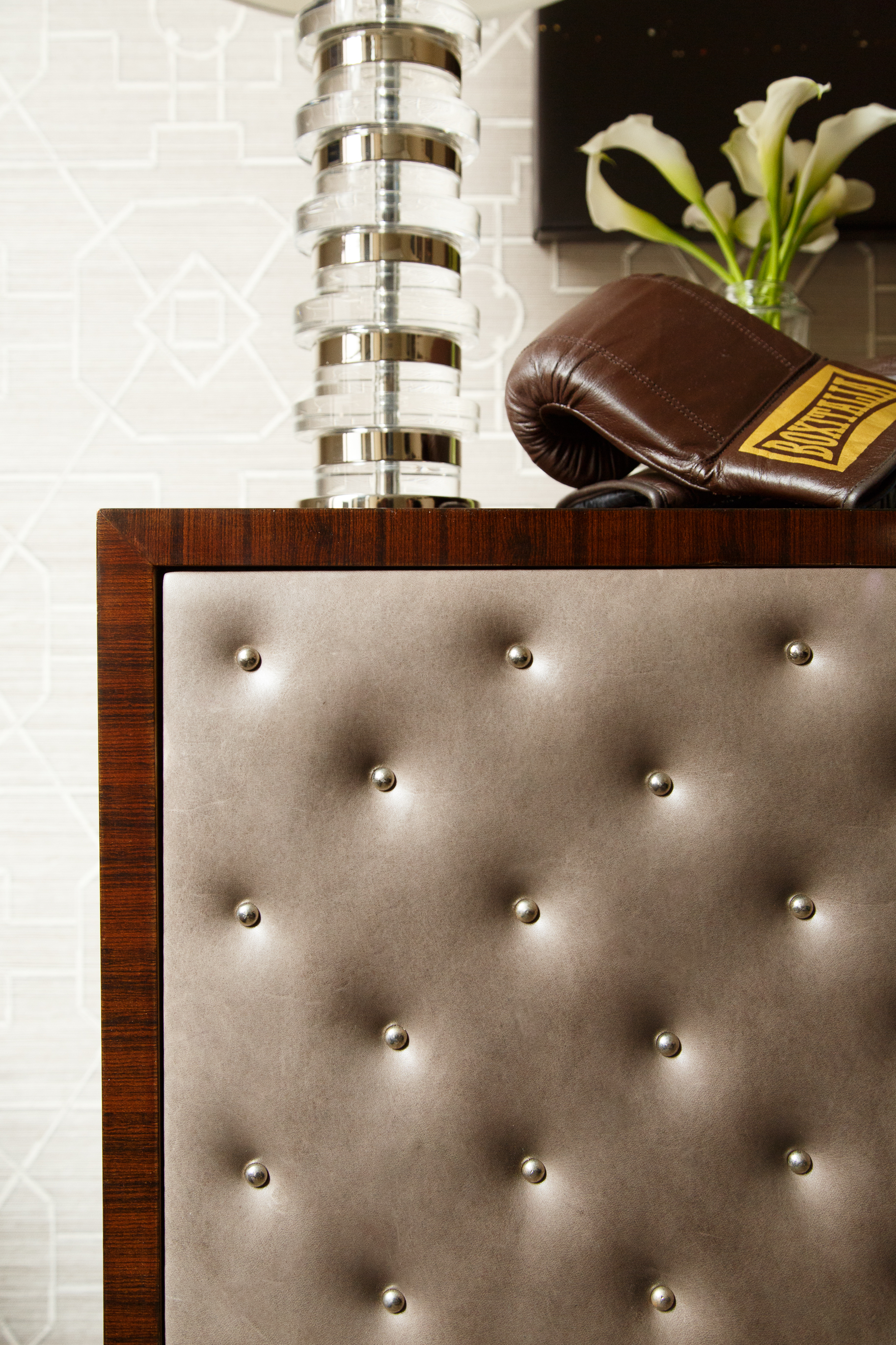
showstopper. (Particularly when paired with 2 sleek, black leather director chairs with platinum legs from Mitchell Gold + Bob Williams Home.) It also serves as a focal point in the room: when people enter, our client is sitting at the desk - it provides a backdrop for what will happen next. The look is topped off with much needed storage. As the cherry on top we brought in the stunning Luoro Preto wood veneered cabinet boasting silver tufted leather and trimmed with nailhead decor on the four padded cabinet doors (also from ABC Carpet & Home). We finished with a leather trimmed natural fiber rug woven in a chic, understated herringbone pattern.
Often in offices you’ll see desks, drawers and cabinets made from matching materials so each piece quietly coordinates with the others. For this space, we opted to create harmony with a classic, unifying color scheme - layering in 2 completely different desks and unique storage, but sticking to tones that work together.
We defined the meeting area with a simple yet sophisticated walnut topped pedestal table from Room & Board and black leather meeting chairs. The very simple, uncluttered, downplayed look of pedestal table is the perfect juxtaposition to the more dramatic pieces on the other side of the space. This table is where the day-to-day work happens with the team.
Since the office is based on 5th Avenue in the center of Manhattan, we wanted to instill some of the city’s creative energy into the space through artwork. We partnered with talented local photographer Steph Goralnick to create 6 spectacular photographs of New York City to breathe life into the room. We had 2 oversized custom canvases created to anchor both sides of the room and then used 4 smaller canvases to create a gallery wall.
For a final touch, we brought in greenery to add a little noise to the quiet room. Strategically placed potted plants pull in fresh, pops of color (and fresh air!) to the neutral space.
The final result is a tactile mix of textures, finishes and patterns that work within the same rich palette to create a relaxing, yet visually interesting space - with no unnecessary distractions. Well, except for the mini bar.
Cheers!
E + M
All photos appearing in this blog post were taken by Pablo Enriquez.


